The challenge was to find a balance between professionalism and the warmth that defines this brand. It was essential to develop a graphic identity capable of deeply connecting with its target audience, encompassing both the cultural and emotional closeness of the Latin market and the American public. This challenge involved creating an inclusive, authentic and attractive visual language that reinforced the brand’s values and managed to resonate in both cultural contexts.
Project Type
New Branding
Industria
Health Industry
Lugar
USA
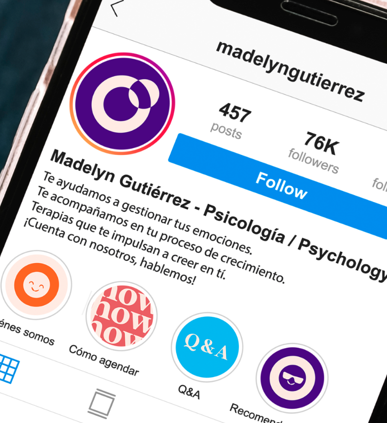
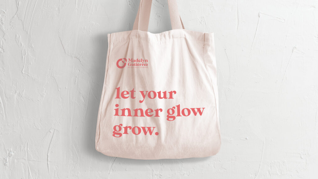
MADELYN
The Opportunity
Through a detailed analysis of the culture and vision of this new brand, our team managed to clearly understand the needs and aspirations of this project. This collaboration allowed us to develop a comprehensive strategy, which not only drove Madelyn’s growth as a company, but also strengthened its identity and positioning as a unique and authentic brand.
WHAT DID WE DO?
Research & Analysis
Brand DNA
Personality
Voice Tone
The Output
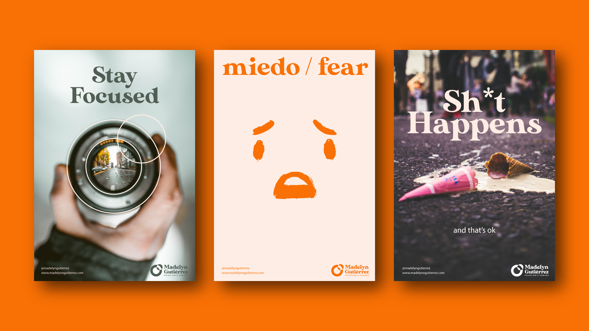
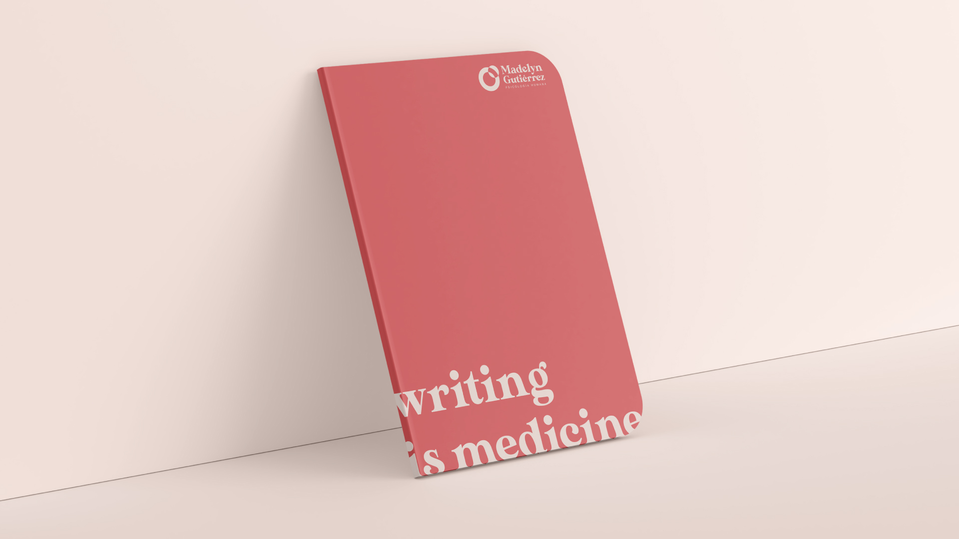
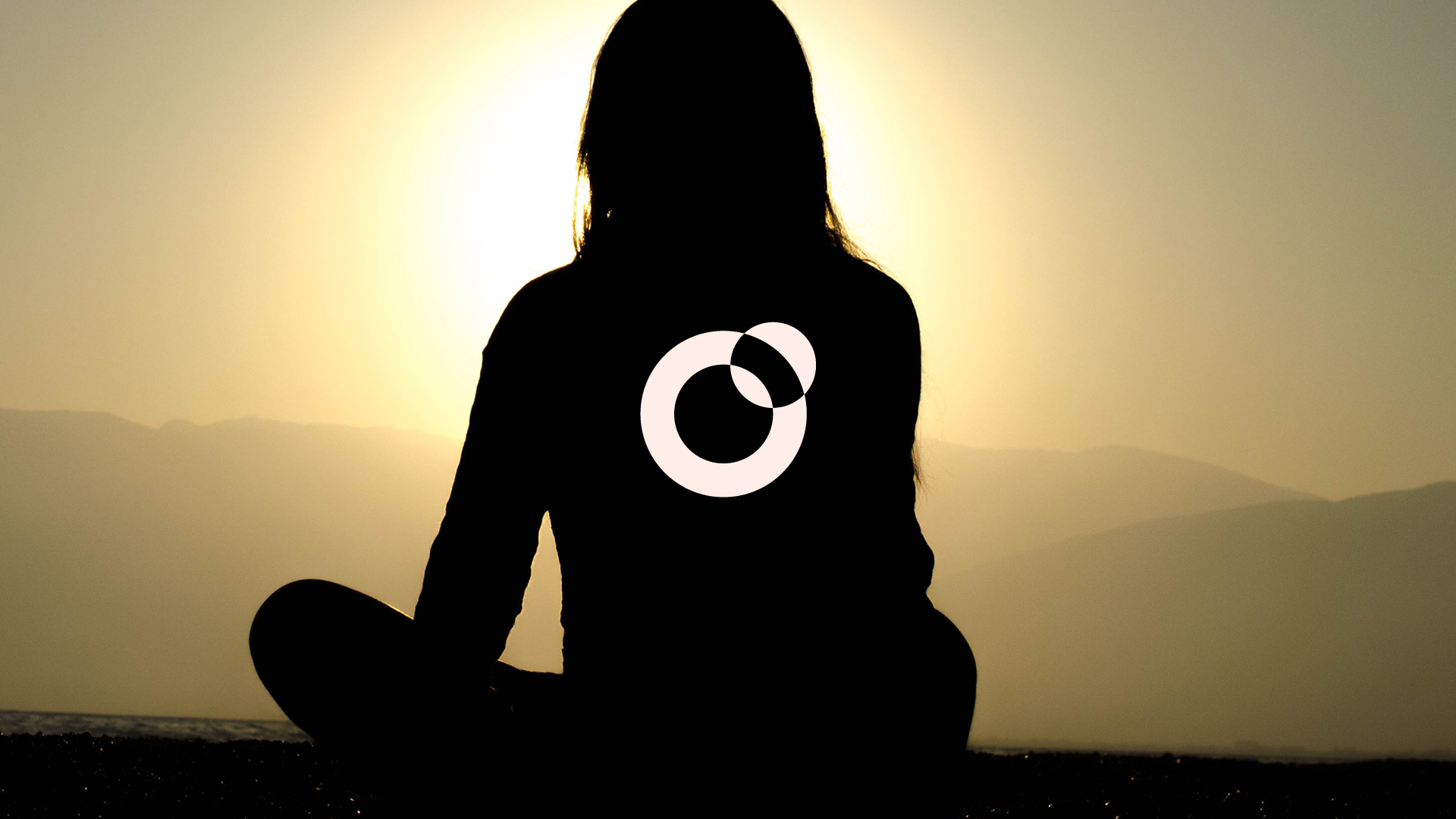
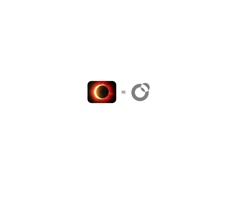
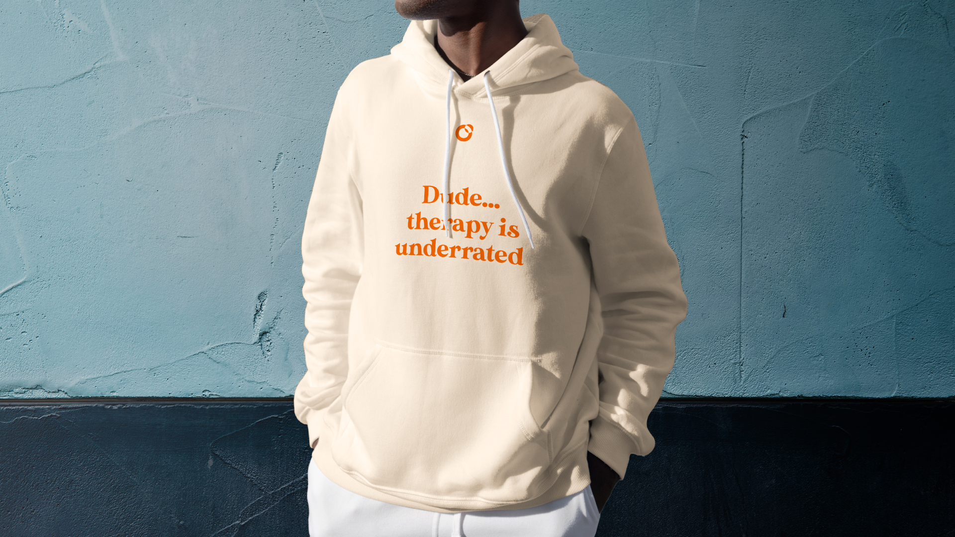
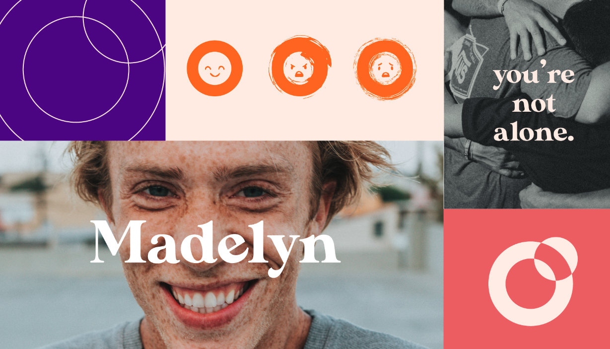
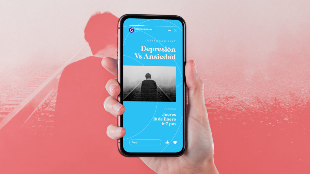
We designed a clear visual identity that embodied Madelyn’s values and purpose. The symbol is an abstraction of an eclipse, which represents that light that comes out again even after absolute darkness. Likewise, we designed a complementary graphic language with emojis, colors and key messages that we defined according to the tone of voice built to connect with the target audience.
What did we do?
Brand Essence
Mission, Vision and Value Proposition
Look & Feel
Illustration
Are you ready
to transform
your idea into a brand?


 by El Taller del Sabueso © 2026