The challenge stemmed from the need to refresh Ceinfes’ visual identity without losing its essence and recognizable attributes, which had already gained prominence in the market. The challenge lay in finding the right balance between warmth and experience, ensuring the brand remained recognizable while simultaneously attracting new consumers seeking brands that reflect values they can align with.
Type of Project
Rebranding
Industry
EDUCATION
Location
Colombia
CEINFES
The Opportunity
The opportunity presented by this project lay in communicating, clearly and powerfully, the company’s commitment to the country’s growth through education, as a driving force for development. Given that the competition lacked Ceinfes’ experience and resources, you had to create a visual identity that evoked all of these competitive advantages.
What did we do?
Research & Analysis
Brand DNA
Values
Tone of Voice
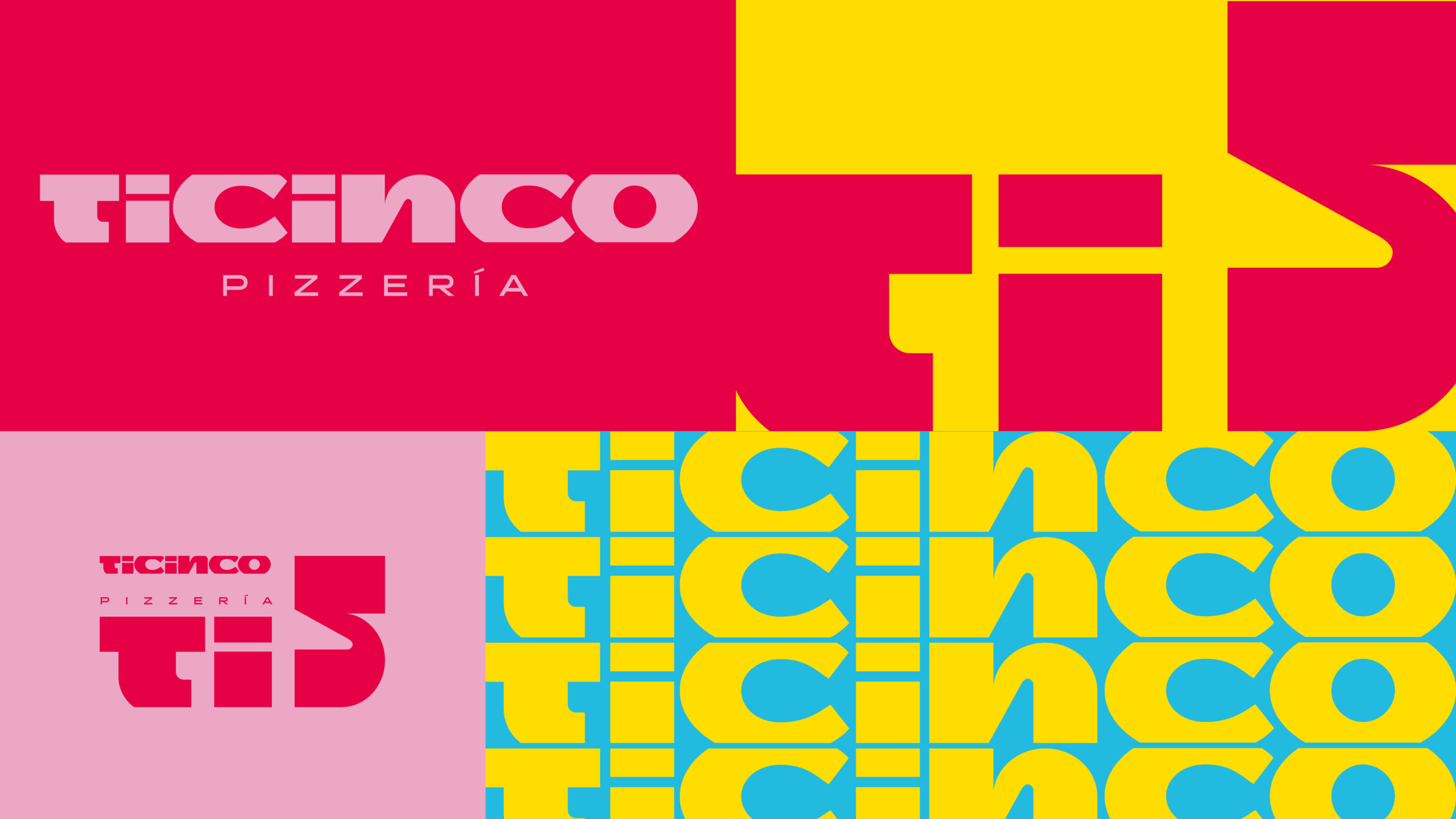
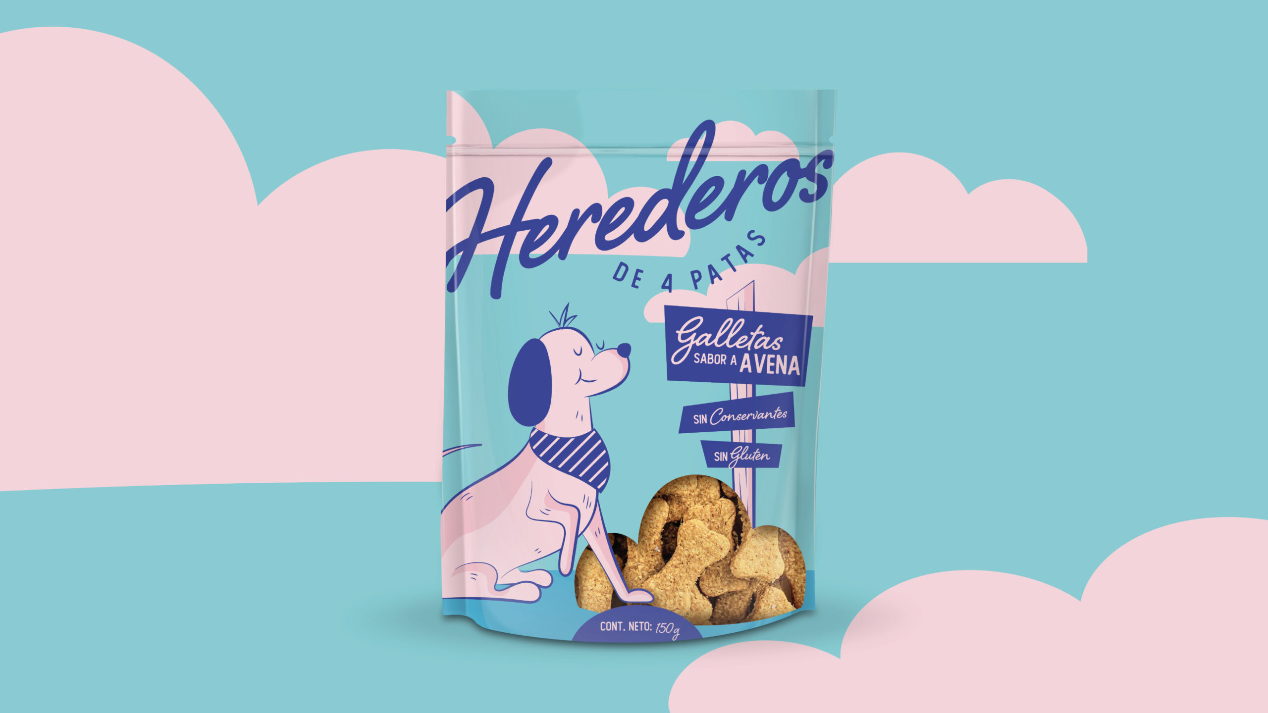
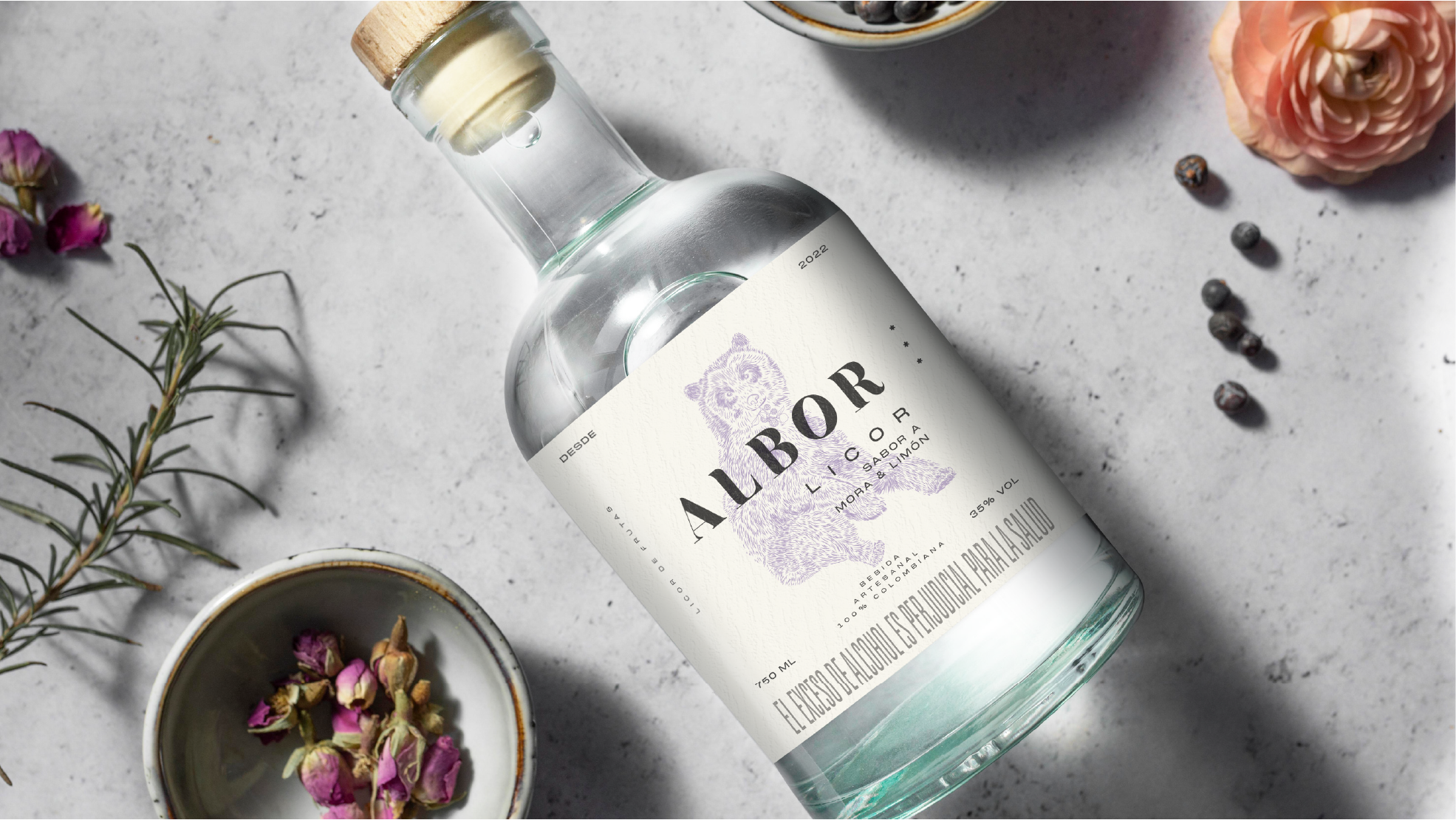
The Output
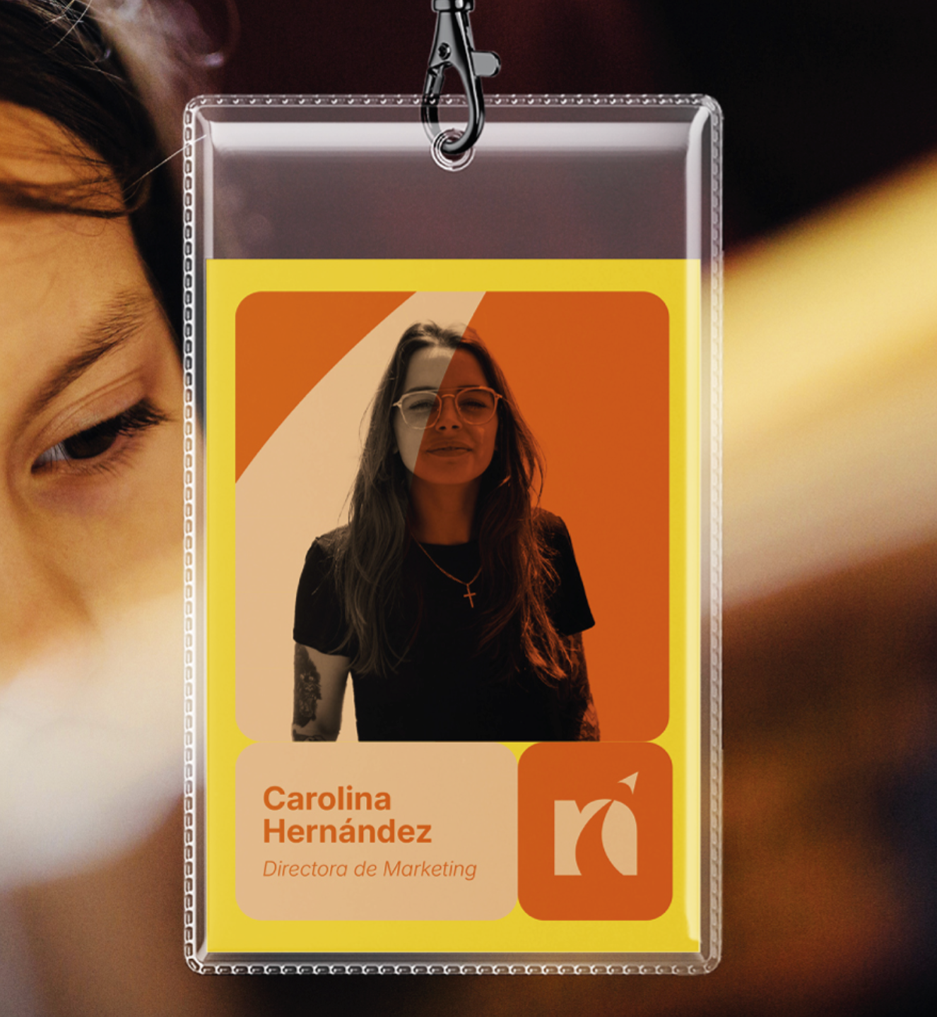
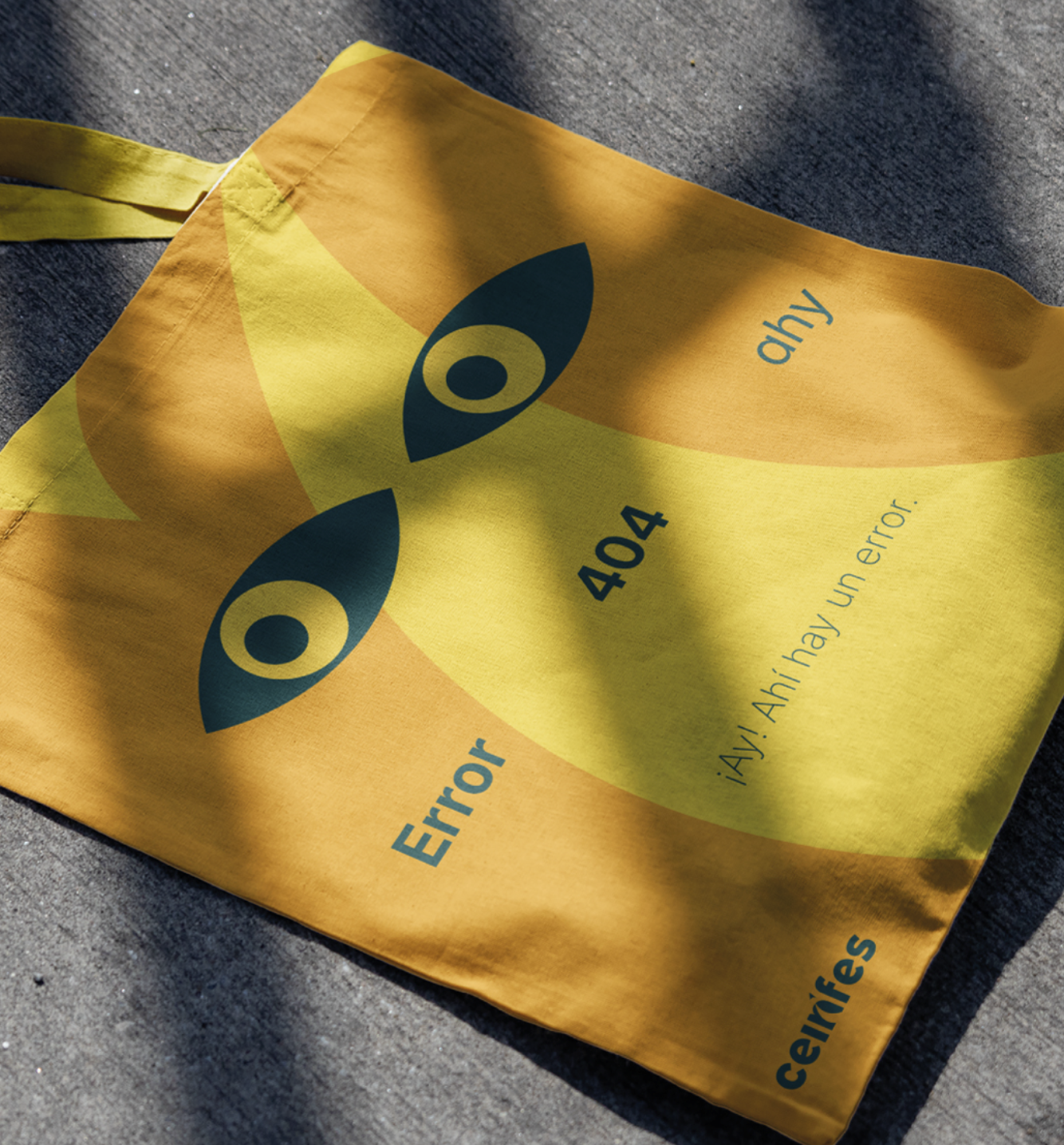
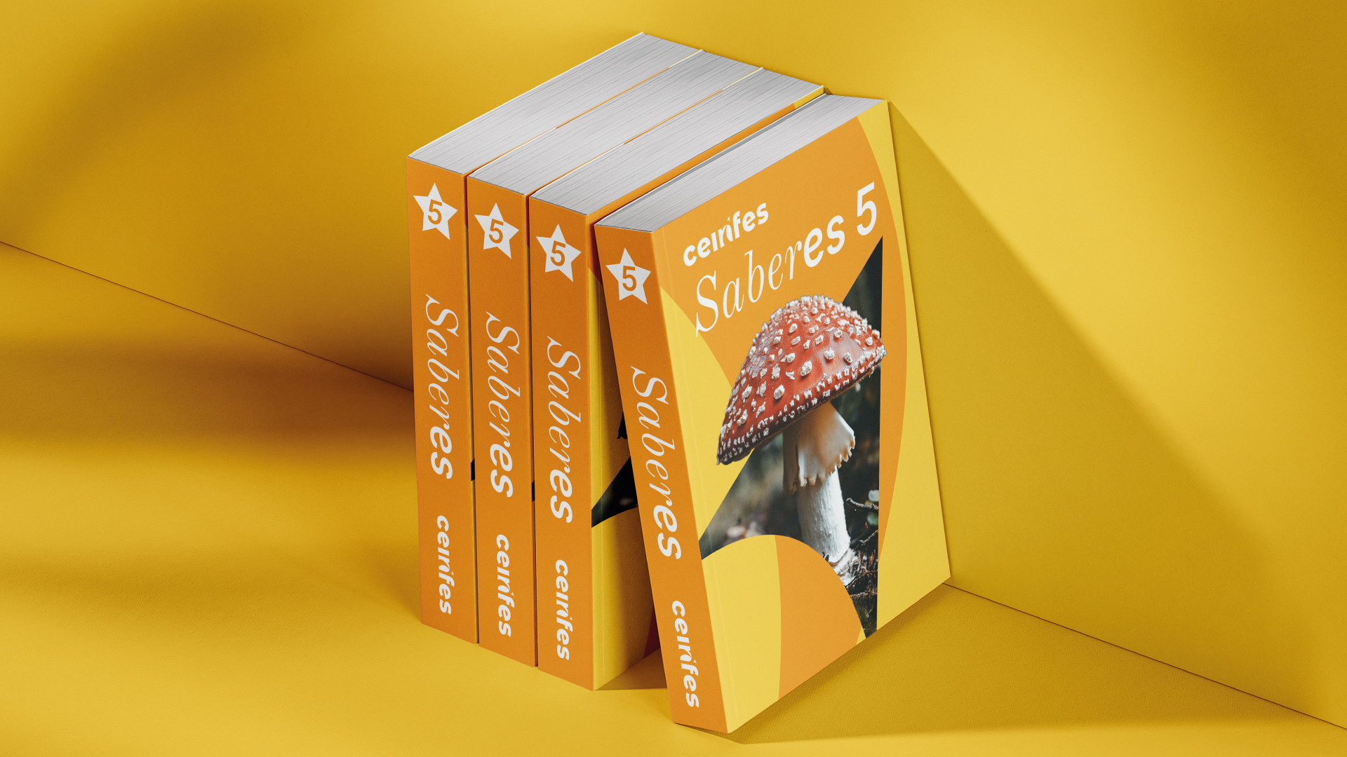
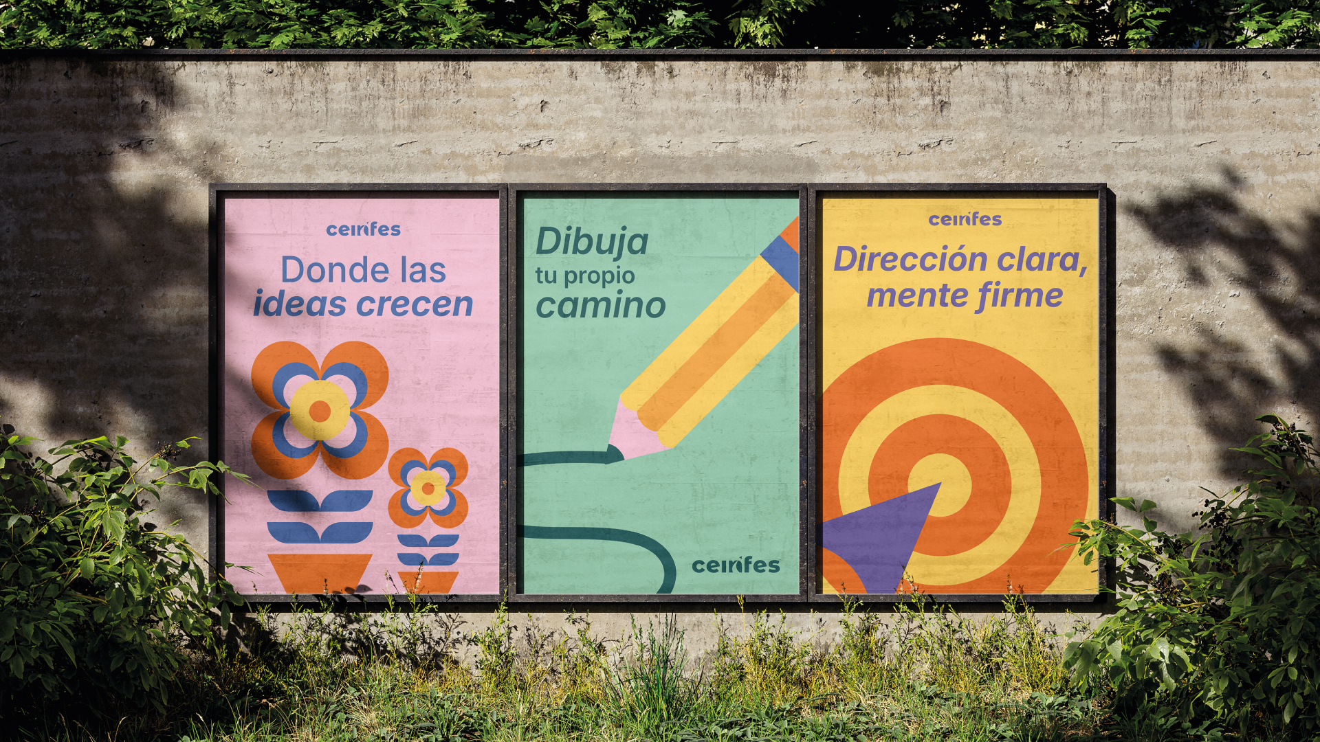
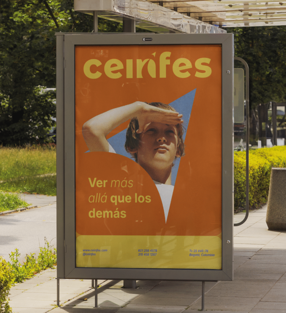
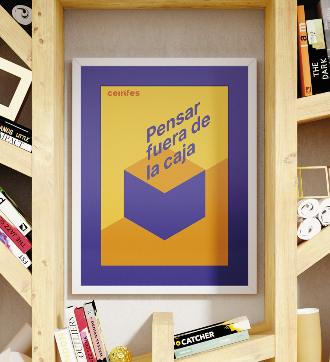
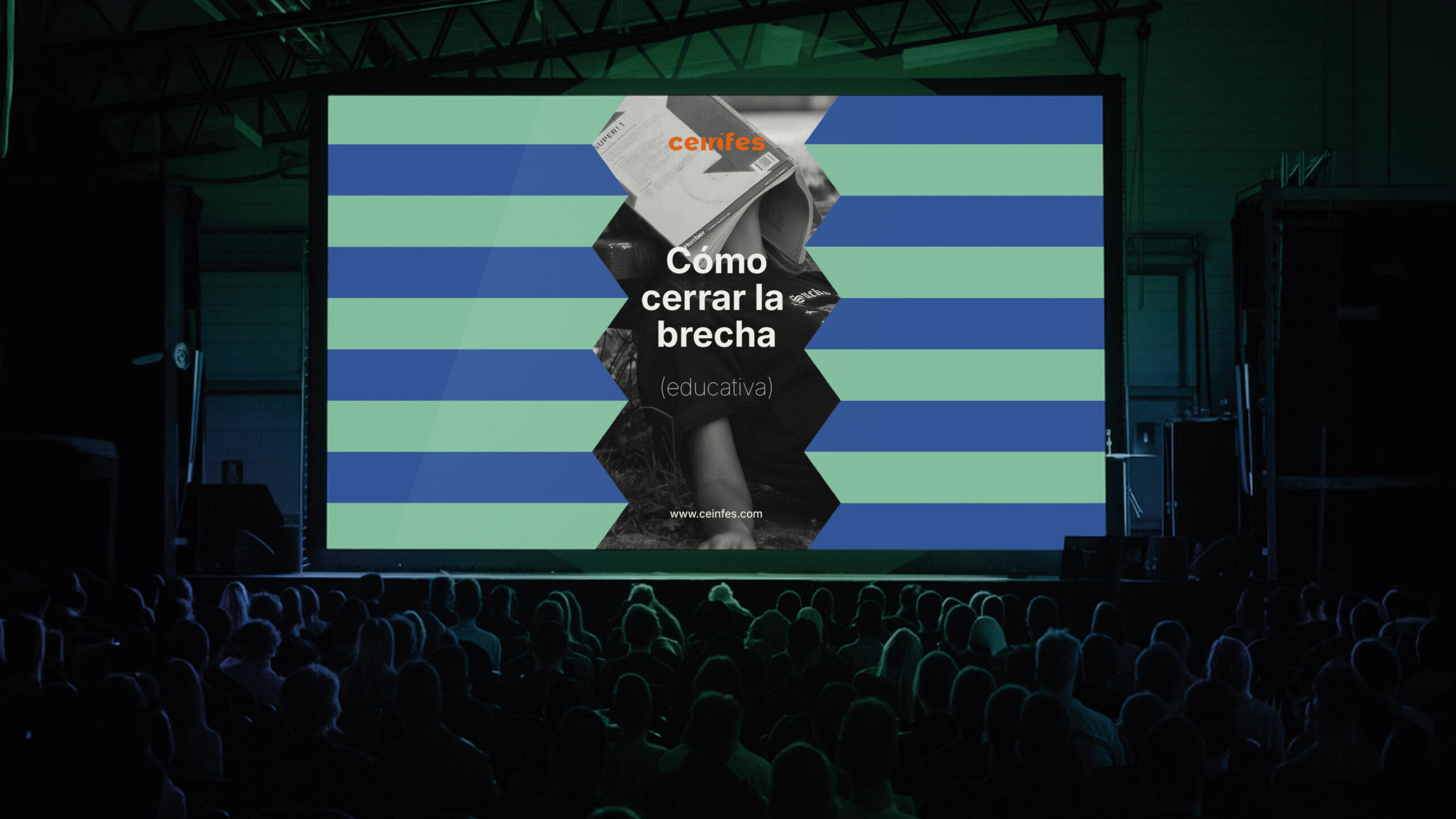
We identified the most memorable elements of the previous identity and transformed them into a logo that retained the essence of the symbol, using a simple yet timeless typeface. We also designed a robust graphic universe that wasn’t solely reliant on the logo; therefore, we created a comprehensive system comprised of icons, complementary typefaces, colors, photography, and a distinctive tone of voice that sets it apart from its competitors.
What did we do
Brand Essence
Mission, Vission & Value Proposition
Visual Branding
Are you ready
to transform
your idea into a brand?


 by El Taller del Sabueso © 2026